EDIT: A primed tortillon - dip just the tip of your tortillon into the oil and blot several times with tissue or paper towel. The tortillon is ready when the marks you make by scribbling with your tortillon on scrap paper are dry. Yes, the tortillon is dry and pushes the pencil color like magic! No need for all this nonsense with gamsol/OMS/Zest-it type solvents- just apply the OMS and go. A wetter tortillon with OMS will give you great effects and will need less blending muscle.
Another tip, if your tortillon doesn't seem to be blending as well, rough it up on the sandpaper occasionally, do this before you think you might need more baby oil. Also lightly mould the roughed up tip back into shape with your fingers.

Here is a "no fail" technique and good to start off with. It will never do you wrong LOL! Just above, I have shown a purple flower ( prismacolor used - violet pc932). I have outlined the edges with a medium color line and I have kept the right petal unblended. Once you have outlined your whole flower, take your "clean" primed tortillon and make tiny circles around the line, working your way along the lines, trying to pull the colour into the white area of the petals. You will notice the tortillon feels scratchy when blending - get used to it ;) Then blend the same way on top of the area you have already blended out to soften the colour and bring the colour faintly into the white areas. A tip - if you are running out of colour; go back to the coloured line and grab a bit of colour from it and continue on with your blending. Notice the petal opposite the unblended one is one that shows the initial blending step. Blending might take some working and reworking, don't be afraid to "work it", you will win! :)
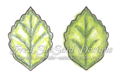
Here is a "no fail" leaf with a bit of an extra twist. Outline the leaf with a dark green ( Olive Green pc911) and then outline that colour with a medium or lighter green ( Chartreuse pc989 ). If the leaf had inked veins, outline those too. Fred's fast and dirty method - blend with a circular motion through the dark and through the light green working your way to the white areas of the leaf. Proper way, blend the light green first then go back blend the dark green out. Notice how crummy my colouring job was - oil/OMS blending is very forgiving LOL!
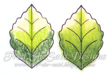
Here is another leaf technique. I used Olive Green, Chartreuse, and Cream (pc914). Cream is one of those colours I would NOT be without, I use it in almost every project. I usually use it in the "white areas" of a flower because it is just "warmer" then stark white... ok now I found the word, it adds "richness" just like real cream LOL. Work your way from light to dark, then you won't contaminate the light areas.
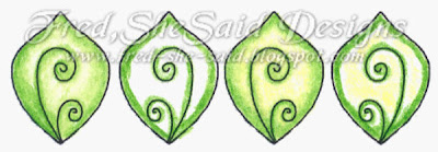
Here is another leaf showing the difference of adding a light yellow to the white areas before blending. It is much more pronounced in RL than in this scan. This helps add POP when your dark green doesn't have much yellow tones in its pigment. I used apple green (pc912) here and it does have a fair bit of yellow tone.

This flower is on the small side in RL. Notice how I shaded it on the unblended petal. Also after blending was done, I took a pale pink and "scrumbled" a bit of colour in the lighter purple areas ( you can also blend this out but not necessary). Scrumbling ( well for me in this example) is making tiny circles with very light pressure - see the pink "blob" to the right of the flower. Colours used - Violet pc932, Lilac pc956 and Pink pc929.

Here is another technique. Work your tortillon into the pink colour at the base of the petal and then work the tortillon back and forth in a straight line out to the top of the petal, you will get a blended streak/crease. Then continue on "circle blending" from the base and outlines to shade the flower. I am pretty sure I used Pink in this one ;)

Please click to enlarge - a must see up close :)
I don't know what to call this technique, Variegated perhaps? Colour like above ( I used Cream and Mulberry pc995). Blend the cream first to smooth it out. Work your tortillon into the base colour to get as much colour on to the tortillon as you can then do that straight back and forth blending like the pink flower in a straight line, keep adding "streaks" like in the middle flower; you can blend out the top of the streaks to soften. Go back and do circle blending at the base and work up a bit. Isn't that cool!? The smaller flower to the right is done similarly, but you are working down the petal.
Here are some more examples and "teasers"! Have a great day and I hope you enjoyed this tutorial :)
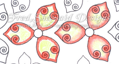
Colours - Carmine Red pc926 & Deco Yellow ( retired )

Colours - True Blue pc903, True Green pc910 & Canary Yellow pc916

Colours - Dark Brown pc946 & Yellow Ochre pc942

3 comments:
Thanks for this tutorial Tracey! Have blended with water/watercoloured pencils before, but not done anything else, so great to have the information about the tortillons and oil etc. and a way to get around the fact that printer ink bleeds with water.
Can't wait for those flowers!! Gorgeous!
Love your site
Great tutorial, thanks for takeing the time
Thank you so much!!
Post a Comment